
We felt that enigma codes are a large part of many thrillers and horrors today, and the title sequence of 'se7en' gives many enigma codes as the audience are constantly wondering what is going to happen next and who the killer is. Enigma codes are used so that the audience are able to make their own suggestions about the narrative. When looking at Vladamir's theory we decided that we wanted to try and change the conventions that had been created by this theory; instead of starting with an equal equilibrium, we wanted our villain (the killer) to kill the central protagonist of our title sequence which would cause a disruption in the equilibrium. We wanted to build on this idea of suspense by Incorporating a heartbeat sound clip within the title sequence, the idea of a heartbeat or heavy breathing is used within a large amount of thrillers and horrors nowadays as the audience would match the heartbeat and the breathing without actually being aware of the fact they are doing this. We also liked how within the film Schindler's list, the only colour that is ever seen throughout the film is the young girl in the red coat which coveys the only colour and happiness of the film. We didn't want to take all of the colour out of our film and so we colour corrected it so the red ribbon stood out more than everything else.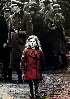


Also within the opening title sequence of Narc a chase is taking place between two of the characters and the audience are unaware of who they are and their importance which creates an enigma code for the audience as they try to figure out who they are, we felt a chase scene would work well for our film. From Narc we also liked how they used breathing sounds which causes the audience to match their breathing to the characters, we wanted something like this within our film and so we decided that by having a heartbeat constantly in the background would mean that the audience would match their breathing to the characters.
2.How
does your media product represent particular social groups? Within our title sequence we felt that by having the killer in very dark clothing this would have the connotations of evil, danger, death etc which would add to the mise-en-scene of the character. We did also subvert the typical connotations of a killer due to the fact he is wearing a casual pair of black jeans, which suggests that the killer is perhaps middle/ working class.Also the shoes that the killer is wearing, although they are black they are also very typical shoes that would be worn by a younger generation which creates an enigma code as to the identity of the killer.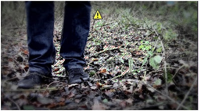 In other shots when the killer is handling the things within the box, the killer appears to be wearing a checkered shits this again reinforces the idea he is a simple working man. Many people may not think this appears sinister, but in fact it is far more sinister than most killers as he could just be a normal man living in a normal community which is not the stereotype of a killer. The contrast of the clothing could create an enigma code the it is not just one killer, or perhaps it could be suggesting that the killer has a split personality or a psychological issue.
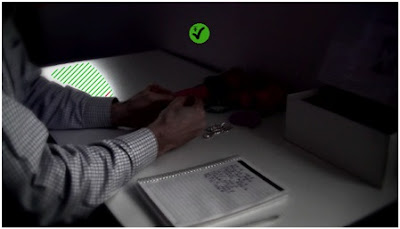
In other shots when the killer is handling the things within the box, the killer appears to be wearing a checkered shits this again reinforces the idea he is a simple working man. Many people may not think this appears sinister, but in fact it is far more sinister than most killers as he could just be a normal man living in a normal community which is not the stereotype of a killer. The contrast of the clothing could create an enigma code the it is not just one killer, or perhaps it could be suggesting that the killer has a split personality or a psychological issue.
The young girl throughout the title sequence is always wearing very pink and pastel colours, this could be significant of a normal young girl as it suggests her innocence and vulnerability due to the fact that she is particularly young. The fact that the girl is playing someone so young highlights the fact that the audience would be aware of the fact that within media there are many stories of young girls being kidnapped or murdered by typically older males and so we felt it was important to represent the range of social and age groups through mis-en-scene.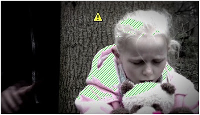
3.What
kind of media institution might distribute your media product and why? When filming and editing we decided that we would use the company 'Film 4' for the production of our film as it is typically a niche and low budget British company which means the film would mainly be distributed throughout the UK http://www.film4.com/. Cinema's are a wide source of media consumption for the younger generations of audiences, but many different viewers can enjoy cinema. It does also mean that different social classes are able to enjoy films and so it doesn't mean a certain class is to enjoy a particular genre of film. Many films are also distributed nowadays through a DVD format that is particularly popular with groups that wish to view films from their own homes, this is a particularly large means of distribution which would be used to distribute our film.Also selling films online has also become a large part of the media institution within society today and many sites such as iTunes can also be used to distribute films.
Film 4 has distributed a huge amount of films from Enduring love to This is England. One film that film 4 had distributed was The lovely bones which we used within our mood board because we liked the use of silhouettes, although we did not actually use an silhouettes in the end, we used The lovely bones as an initial idea and inspiration for our film of having an older middle class man as the killer and having a young girl as the victim.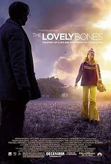

4.Who
would be the audience for your media product?
The target audience we decided on for our thriller sequence was to a certificate of 15, this would mean that our film would appeal to teenagers but also an older audience would be able to enjoy the the film as it involves many scenes of action but also many scenes that contain psychological and crime which includes a build up of suspense. Our thriller was not targeted to any particular nationality although the main nationality may be British due to the production company being a small British company as film 4 usually does. Film 4 has been known to produce well known films that have a large budget such as the Iron lady and Slumdog Millionaire, but they mainly produce smaller niche films such as 127 hours and submarine. We decided that we would prefer to have a niche audience for our film as it gave us more of a chance to experiment and be creative with our title sequence.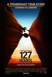

5.How did you attract/address
your audience? The film industry is a huge part of entertainment nowadays, this means that production companies have to focus a large amount on the audience if they wish to make a profit. In order to make the most profit, we would want to try and attract as large an audience as we possible could. However, saying this our film would attract more of a niche than a mass audience.We started our research with a questionnaire on both males and females to see what they liked in a thriller. The results of both questionnaires were not all that different (see blog for questionnaire results) and so this gave us a clear idea of what most people enjoyed in thrillers. The style that was said to be the favourite was an action thriller, however many of our initial ideas led us to go for a psychological thriller as it does not have to be as face paced as an action thriller. We decided to go for a psychological as we wanted to keep the audience guessing about what was going to happen and we did this by never showing the whole of the killer and the audience never see his film which creates an enigma code as to who he is. When doing some research, we found that the average certificate for a psychological thriller was usually about a 12A. We decided that ours would be a suitable 12A as there is no unsuitable material within our title sequence, but younger children might get distressed at the fact there is a young girl in the sequence. Although we decided that we would make our film a 12A it would more than likely attract an older audience due to the psychological content. The official site for certificate choices is BBFC (British Board of film classification) http://www.bbfc.co.uk/. The following 4 categories were included within our film:
Theme
Teenager Mature themes are acceptable, but their treatment must be suitable for young teenagers.
Violence
Moderate violence is allowed but should not dwell on detail. There should be no emphasis on injuries or blood, but occasional gory moments may be permitted if justified by the context. Sexual violence may only be implied or briefly and discreetly indicated, and must have a strong contextual justification.
Horror
Moderate physical and psychological threat may be permitted, provided disturbing sequences are not frequent or sustained.
Imitable behaviour
Dangerous behaviour (for example, hanging, suicide and self-harming) should not dwell on detail which could be copied, or appear pain or harm free. Easily accessible weapons should not be glamorised.
 We felt that these were the reasons for making our certificate a 12AWhen looking over the site and the certificates that are given we felt that ours might be disturbing for young children to watch, but at the same time as it is a thriller and does contain psychological effects and perhaps some unsuitable language so this means that any lower rating would not be suitable. On the other hand if we were to give it a 15 or 18 it would probably be too high a rating as there is not large amounts of unsuitable footage. For casting the killer is most commonly male and we decided to stick to this by casting a tall well built male for our title sequence. Within our actual film the main protagonist would not be the young girl as she is murdered, but the title sequence is to show what the killer does and so we felt that we needed to establish that he killed children. This is why we went on to cast a young girl for this part and we dressed her in very pale clothing to show the innocence of her character, the audience when seeing the young girl would instantly create a connection with her when realizing she going to die. We decided that we wanted one of our main themes to be suspense as it makes the audience react far more than they would in most films which would mean they would be 'on the edge of their seats' more than most films.
6.What have you learnt about technologies
from the process of constructing this product? Through the editing and filming of our production, I have learnt about how to develop my computer skills within many different areas. Particularly including the use of the Macs for our project and the software they contain such as final cut pro. Before this task I have never used final cut pro and so this made it interesting to learn how to edit different clips and sounds together so that they match with one another. By using final cut pro and soundtrack pro, we were able to come up with a range of creative ideas to experiment with for our title sequence.
 When looking for a particular font we ended up using a font called Old typewriter that we had found on a website made specifically for fonts, which we had to download and install onto final cute pro in order for us to be able to use it properly.We also learnt how to layer different clips of music together in order to create the thrilleresqe feeling we were trying to achieve by creating a build up of sounds.
 .png) We had also learnt how to use motion which allowed us to change the brightness of different colours within the clip such as the red ribbon, so that that this item dominated the frame so that it immediately caught the audience members eyes.
We had also learnt how to use motion which allowed us to change the brightness of different colours within the clip such as the red ribbon, so that that this item dominated the frame so that it immediately caught the audience members eyes.7.Looking back at your preliminary task, what do you feel you have learnt in the progression from it to the full product? Looking back at the preliminary task, I feel that I have been able to develop from the mistakes I made. When completing the preliminary task, we did make quite a few simple mistakes such as the 180 degree rule and a few simple continuity errors. Although the preliminary task was far more simple compared to the title sequence task I felt that in fact the title sequence task was easier in some ways. The fact that we got far more time to look in depth into the task and what was needed for a thriller meant that we were able to get a clear idea of what was needed, this was shown when we began to do our questionnaires on thrillers to gather information. I also felt that the preliminary task had given a good basis and practice for developing our shot techniques.
The fact that we had made mistakes within our preliminary task meant that we were able to learn from our mistakes and this meant that we were far more organised with storyboard and shot lists and we also made sure that we discussed all of our ideas with one another.
We found that when recording our footage it was far better for us to get as much footage together as we could on one day instead of going back on different dates and this idea worked perfectly for us and meant we were also able to experiment with a range of different shots.
Within our preliminary task we found that the error of the lighting and audio meant that the continuity of the clip was not done particularly well , this meant that we all knew how important it was to make sure that everything was kept the same throughout. However, when we did decide to use different lighting we made sure that the artificial lighting did not take over the natural lighting that there already was.
Within our preliminary task we found that the error of the lighting and audio meant that the continuity of the clip was not done particularly well , this meant that we all knew how important it was to make sure that everything was kept the same throughout. However, when we did decide to use different lighting we made sure that the artificial lighting did not take over the natural lighting that there already was.
Overall, the progression has been a large step from the preliminary task due to the organisation of the group on a whole but also the experimentation of different effects, shots and music.


.png)


.png)


